
Our first design was submitted by Tom Williamson. He explains:
“The gold Liver bird represents the wealth and prosperity of Liverpool. The gold colour is also found on the flag of Lancashire, and I’ve chosen it to represent Liverpool’s historic ties with that county. Although the red and blue are there to represent the football teams, the red and blue are taken from the Union Jack to represent the British connection. I’ve placed the blue on the left to represent the location of the River Mersey in relation to the city.”
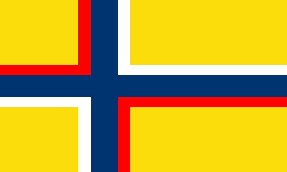
Our next design was submitted by Brett Guessford:
“I started with a Nordic cross to represent the Cathedrals and the Nordic origin of the term Scouser. The background is yellow to signify the wealth of the city. I have included blue for the River Mersey, as well as red and white to represent England.”
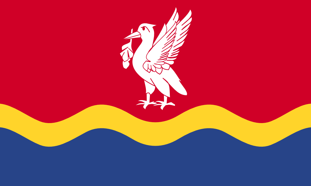
The above design comes from Paul Johnson:
“The red is from the red rose of Lancashire. The wavy blue is for the River Mersey and the sea beyond, with a gold band representing the wealth generated from Liverpool’s maritime history. The Liver Bird is white, representing peace and harmony between the city’s different communities.”

Design number four comes from Geraint Parry:
“The blue and red sectors represent the colours of the football clubs. The crosses represent the two cathedrals in the city. The historical significance of the shipping industry in the city is represented by the ships wheel.”
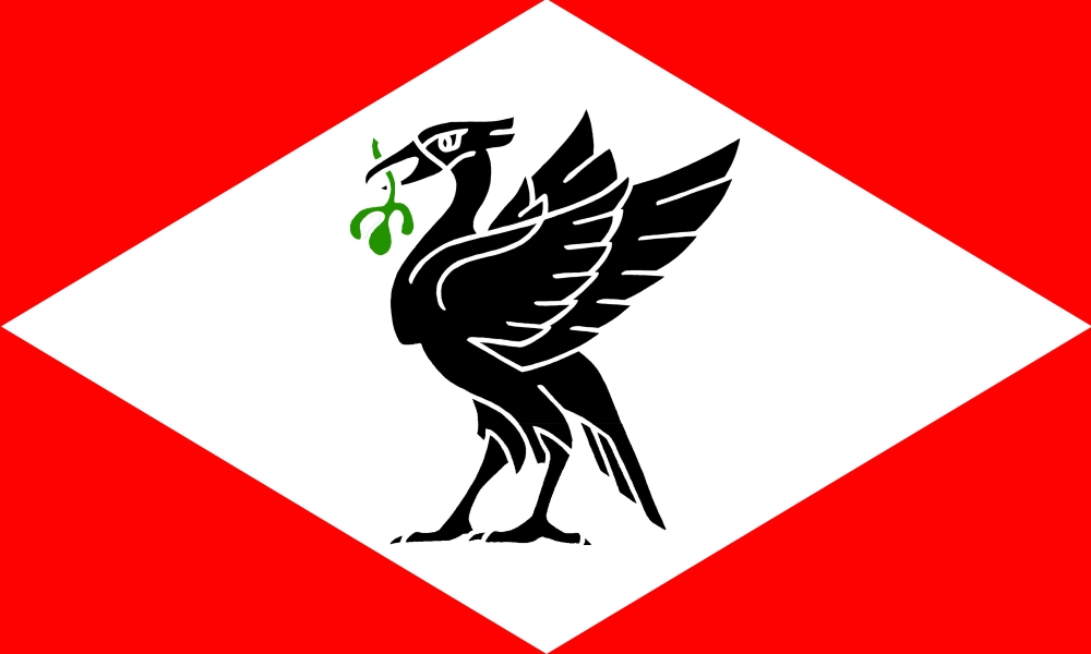
Our latest design entry comes from Leigh Cotterill who writes:
“The flag has a red field with a white diamond in the centre. This is inspired by one of the early flags used by the Mersey Docks and Harbour company , which symbolises the central role in the City’s history and growth that the docks have played. In the centre of the white diamond is placed the Liver Bird that is iconic of the City, the black colour with green seaweed sprig used as it is on the Council arms.”

The above entry comes from Adam Irwin.
“The City of Liverpool flag contains a single wave, this relates to the River Mersey that is at the forefront of Liverpool. The town originally consisted of 7 streets which has been represented in the number of ripples within the wave.”

The next entry is from Jordan Scott.
“Red symbolises Liverpool, and the blood of the slaves that came through the city. The blue symbolises Everton and the River Mersey. Gold symbolises the wealth of the city through it’s maritime history, and the Liverbird symbolises the city’s history.”

Our latest entry comes from Dino Buturović who writes:
The flag consists of 7 blue and white stripes symbolic of the Liverpool’s
original 7 streets. The yellow field with the stylized rose of Lancaster is
symbolic of the city’s historic county of Lancashire. It was also the
symbol of the 55th West Lancashire infantry division in WWI and WWII, that
was made up mostly of Liverpudlians.
If you would like to enter a design, please go to our submissions page. Happy designing!

I have for a long time (on and off) wondered why i haven’t seen an Official Liverpool City Flag’ i now know why’ it’s thanks to the’ Flags for Liverpool Campaign that hopefully we will be getting one done in the very near future,
After looking at the six designs submitted and after reading up on how to build a flag i thought’ even i could have a go at designing one’ then i thought’ whats the point the best examples are already submitted’
To my mind’ the best one to me is Tom Williamson’s design and it looks fantastic in the 3D virtual picture’ thats the one for me’ well done Tom,
Also’ i liked the other designs by Paul Johnson, Geraint Parry and Leigh Cotterill’ in that order.
Well done Flags for Liverpool.
Regards Chris Abbott, a kid from the late 1940s-50s Scotty Road.
Looking forward to this getting more attention, especially with the possibility of a Liverpool Commonwealth Games bid developing.
Like Chris, I also prefer Tom Williamson’s design of those on offer so far, but there are some good ideas here. Perhaps a wavy border between the two colours red and blue could more clearly infer the Mersey?
One thing that struck me however, is that there is no reference to the musical history and legacy of the city. Could someone introduce that into a design? I am not artistic enough to produce something of merit but to provoke ideas how about adding a stave into the Liver Bird’s wing feathers, featuring the first four notes of She Loves You, to represent the city’s music and the people’s extrovert and friendly nature?